Article | Back to articles
UX Files - The UX of buttons
01/03/2021 by Benoit Rajalu
This article is part of UX-Files, a series in which we give a stern but loving look at web interface patterns through three lenses: UX, UI and finally code. This time it's all about the button. Welcome to part one: user experience.
The button is ubiquitous. You've probably clicked a dozen just today while browsing the web or using your phone. Some fridges have digital buttons. Think about it. The button is the boiled down, syrupy, condensed flavor of screen interfaces around the world.
But what are they actually? What sets a button apart from the ruble? When is a button being bad? There are many ways to look at it, maybe a good one is a button you never have to think about. In other contexts, maybe it's the total opposite: you want a button that's going to stick to the visitor's mind like a pop song.
Let's get exploring then.
The fundamentals of a button
Simply put, a button is a clickable interface element that is not a hyperlink nor a form value element.
It is not a hyperlink because fundamentally a link does something very specific: it navigates away from the current context (either by jumping to an anchor or simply going to a different page). That's the only job ever given to links, it's their singular, semantic purpose.
What's the semantic purpose of a button? Their default nature is to submit forms (and not enrich their values). A humble job but what's the internet if not a series of forms after all. They are more versatile though: they can become triggers for pretty much anything.
They are so versatile in fact that you can make a button act like a hyperlink, an idea that brings us back to the original set of questions: when is a button being bad?
On the web, chances are you're going down the wrong path when you're trying to make an element behave like another native solution. Being able to certainly has value, but it also has consequences. In the case of buttons, it comes at the cost of the obvious additional work needed to make them act like links.
Any work you do to hijack a native component to make it behave like another is not something to do slightly. You're bending the platform. There's hubris in that.
The consequences are also seen in a difference of accessibility. Though both links and buttons are focusable and read by screen-readers, they do not get presented the same way and do not support the same keyboard interactions.
Chances are you'd expect an underlined piece of text to get you to a different page when clicked, while the same text but in a button-like box? You'd probably be ready for something else.
Context and designs naturally help us infer behaviour. This gets lost when buttons try to be hyperlinks and vice versa.
It's very easy to cross that line and rationalize the reasons why we do. After all, the penalty for styling a link as a button (and vice versa) has always been very very low, but it's worth noting: fundamentally these are two different patterns. Maybe we should treat them as such.
What's the experience?
Beside the standard accessibility criteria for buttons (contrast, size, reflow, text-parsability, keyboard focus rings etc...) the ergonomics of a button are difficult to pin down simply because of the high versatility of the pattern.
It isn't simply about the looks of a button (see the next article for that), it's really about the experience it triggers.
Take a text-editor page like this:
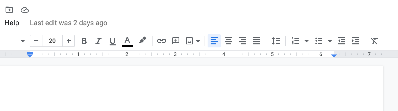
There are a plethora of button types here! In such a complex interface, each instance of a button must be built to make the action they trigger obvious, or at least guessable and at worst easily memorable.
The same is true everywhere else. The instances in which it's OK to think of a button as a mysterious lock on a scary door probably exist in gamified experiences, but they're clearly not the main objective.
Their flexibility also explains why they change their shape so much. On a single application, all actions do not have the same "value". A call to action such as this "Add friend" button:
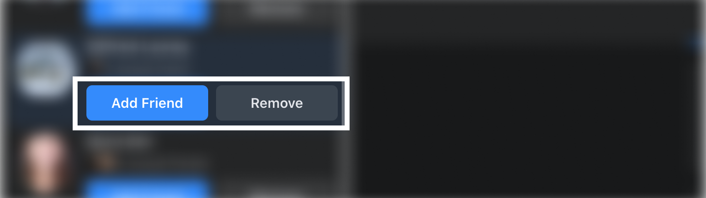
Well it needs its counterpoint. And thus the "remove" button becomes a first variant.
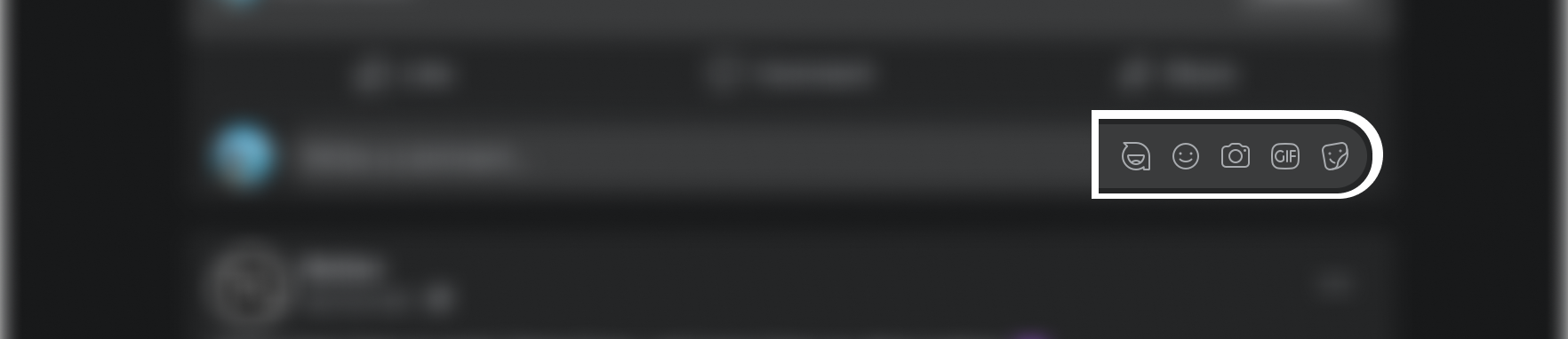
But wait! Not all things are confirm buttons! Some are triggers for actions:
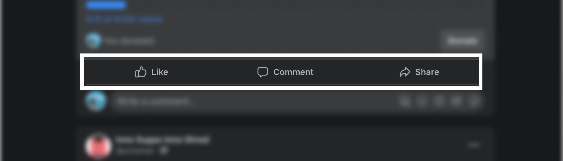
Some are triggers for tools:
What matters is their consistency. In order to form a cohesive experience, a particular shape of button benefits from being used constantly in the same way across your application.
Consistency enables visitors to organically "learn" and expect the experiences they will have. It makes applications friendly, familiar. When you choose to break that rule of consistency, you're left with "surprise triggers":
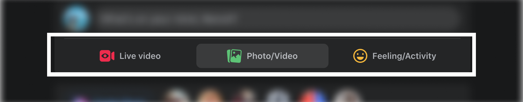
This button group for instance has three similar designs but three different experiences. Clicking on the first navigates to a different page, the second opens a system window for uploads and the last opens a modal. The predictability is low. If you were to find a fourth button like this anywhere in the app, what would you imagine it doing?
It could do anything. The previous instances left you with no clue as to what experience is hidden behind the pattern except for the idea that, somehow, in the end, a new Facebook post may come out of it.
Make it worthwhile
We've already seen that the web is basically just buttons thrown at everybody's screens. They are triggers for various features and experiences for sure, but aren't they also part of the experience?
They are part of the experience indeed, but they are not the reason anyone is using an app. Just like you may enjoy sitting on a train, you're not getting in one just because you're looking for a place to sit. They are the vehicle towards a destination.
But just like in that train, you'd rather have a fun, interesting trip. How does one make an interesting and engaging button? As an interactive element, it's got its chance to shine during mouseover, while being clicked or during transient states (think of a button going from a default to a loading state). However, the line between a nice and interesting ephemeral experience and a horribly tacky one is pretty thin.
The goal should therefore be to find balance. In most cases, investing in ways to make buttons "interesting" can be overthinking it and overwhelming. Have a look back at Google Doc's UI or even Facebook's and how they would feel if each of these buttons had their own little animation, their "voice". It would be very noisy.
If you do want a button to have a louder voice than its siblings on a page, make it a worthwhile choice. Ensure the visitor doesn't waste their time with it and isn't distracted from the core experience that this louder voice must trigger. It's not just about having nice clean Call to Actions (CTAs), it's about not stealing the show. A button is a train. The experience they trigger is the destination. Nobody wants to go home saying "I don't remember where we went but the train was nice".
First rule of the pattern, don't break the pattern
The versatility of buttons are both their biggest strength and easily overlooked weakness. We need so many of them and yet they do not all have the same role, or the same hierarchical value. They're such a multi-faceted pattern at the core of the web interactive experience, it's hard to pin them down. Yet we must try:
- Stick to one role for one design. This creates a pattern, a way for visitors to know what to expect, to "parse" an application with ease and memorise its secrets.
- Find balance. Some buttons have to catch your eyes, some only have to be utilitarian but none must be complicated nor steal the show. They are means to more important ends.
- Focus on their accessibility. As we've seen, buttons are the backbone of digital interfaces. As such, it's your responsibility to ensure they can be used by absolutely everyone.
- Don't make them behave like links. They submit forms, they open modals, they do a lot but they are not meant to do navigation.