2021-03-23
UX Files - Coding buttons
10 min read - Benoit Rajalu
This article is part of UX-Files, a series in which we give a stern but loving look at web interface patterns through three lenses: UX, UI and finally code. This time it's all about the button. Welcome to the final part: code.
We now have designs and documentation for buttons. We could just put our heads down and get to coding them but first, a question.
How do we code buttons? That's a silly question isn't it, you just create <button>{children}</button> thingies and that's a job well done.
It's not that simple. Whether we're working towards a design system or not, we are at least working in various scopes of component libraries at this point. That requires a little more thinking. We want to build highly reusable components, with clearly defined APIs and consideration put into their maintenance cost.
We're not isolated workers either. The design team produces components of their own, but those are not "the truth". They are models. The truth is what visitors use. As such, the design team has a need and a right to easily find that "truth". To make that ever easier, naming and equivalency are excellent allies. But when the design team use variants like those:
Things get a bit more complicated. For the design team, that's a ButtonAction Figma component with two types (Primary and Secondary), three levels (Neutral, Positive, Negative) and five interactive states all bundled up in variants.
It could be worse. In Figma it would have been just as easy to create one gigantic Button component with all the designs for all button "kinds" turned into variants. If we were to stick to the "naming and equivalency" rule, developers could interpret it as a single <Button> component with a lot of props to achieve the same effect.
Instead of doing that, I've split the designs in large semantic patterns. I think it is a better way to document the design language, and thanks to that it becomes easier to translate designs as code patterns. As a dev, I would have preferred breaking the variant down further, having distinct ButtonActionPrimary and ButtonActionSecondary components for instance, but would that make sense for the design team? Do they need that overhead? It's a give and take.
That however brings us back to the question: how will we code these buttons as patterns?
Enforcing button basics
Let's first build our pattern like we would any other element that's going to have users: by ensuring its API makes sense.
Buttons in HTML are, like most HTML elements, wide open. They're of type="submit" by default, something that isn't really relevant to most of the patterns we are trying to build now. They accept classnames and the style attribute: both are threats to our app's design consistency.
We can enforce a more rigorous API by building a BaseButton whose entire responsibility is to offer a sanitized API. We'll start with enforcing better types:
export type BaseButtonProps = Omit<
  React.ButtonHTMLAttributes<HTMLButtonElement>, // classic <button> props
  | "style" // ...but no style override allowed
  | "className" // ...and no override through classes either
  | "type" // ..and only some types allowed, see below
  | "onClick" // HTMLButtonElement thinks that's optional, for us it's mandatory
> & {
  type?: "button" | "submit" | "reset";
  onClick: () => void;
};
We can then apply them to the <button> element.
import React, { forwardRef, Ref } from "react";

export const BaseButton = forwardRef(function BaseButton(
  { children, type = "button", ...rest }: BaseButtonProps, // Here's the typing being applied
  ref: Ref<HTMLButtonElement>
) {
  return (
    <button ref={ref} {...rest} type={type}>
      <span>{children}</span>
    </button>
  );
});
The styling conundrum
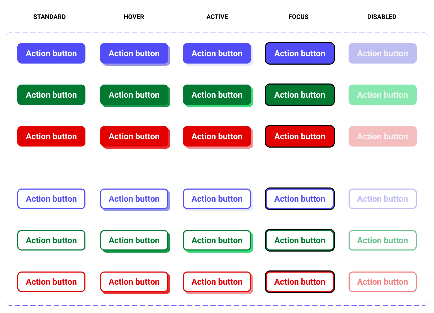
We now have a single reusable "better" HTML button. That however isn't the extent of what we want to pin down as developers. We also need all our buttons to come with styles! We know in advance that, as interactive elements, buttons will need styles for all their states:
- Base: default button styles.
- Hover: the pointer is currently over the button.
- Active: the button is currently being pressed.
- Focus: the focus is currently on the button.
- Disabled: buttons can be disabled. This one's special, not all interactive elements can be disabled.
Our design team (me) has been generous enough (oh, you!) to design for these states but as developers we know that if we are given the chance to forget something, we will. Especially if we're working collectively on a public, expanding library.
To enforce best practice, we can provide opinionated "style builders".
In this case I went with Styled Components, providing a function with a typed interface demanding styles for each state:
import styled, { SimpleInterpolation } from "styled-components";

export function MakeButton({
  base,
  hover,
  active,
  disabled,
}: {
  base: SimpleInterpolation;
  hover: SimpleInterpolation;
  active: SimpleInterpolation;
  disabled: SimpleInterpolation;
}) {
  const Button = styled("button")`
    cursor: pointer;
    display: inline-block;
    border: 0;
    background: transparent;
    position: relative;

    span {
      position: relative;
      z-index: 2;
      line-height: 1;
      display: inline-flex;
      justify-content: center;
      align-items: center;
    }

    ${base}

    &:hover:not(:disabled):not(:active) {
      ${hover}
    }

    &:active {
      ${active}
    }

    &:disabled {
      cursor: not-allowed;
      ${disabled}
    }

    &:after {
      content: "";
      display: block;
      position: absolute;
      z-index: 1;
      width: 100%;
      height: 100%;
      border-radius: inherit;
      top: 0;
      left: 0;
      box-sizing: border-box;
    }

    &:focus {
      outline: 0;
    }

    &:focus:after {
      box-shadow: 0 0 0 0.2rem rgba(0, 0, 0, 1);
    }
  `;

  return { Button };
}
As you've seen, MakeButton is also our chance to do a little more than enforce best practices: we can use it to lay down common styles for our army of buttons.
Gathering our two base elements forms a single toolset that will help us produce buttons, but what about variants? Will I need to write all my styles all over again?
In traditional CSS we would simply extend the styles of the default elements and use the cascade to do the distinctions. We can do that too, using an additional MakeVariant function that relies on being given a Styled Component to expand from:
export function MakeVariant({
  button,
  base,
  hover,
  active,
  disabled,
}: {
  button: AnyStyledComponent;
  base: SimpleInterpolation;
  hover?: SimpleInterpolation;
  active?: SimpleInterpolation;
  disabled?: SimpleInterpolation;
}) {
  const Variant = styled(button)`
    ${base}

    &:hover:not(:disabled):not(:active) {
      ${hover}
    }

    &:active {
      ${active}
    }

    &:disabled {
      ${disabled}
    }
  `;

  return { Variant };
}
Combined, we now have a "private" button, something not made to be used directly but to build our patterns from. Think of it as a sourdough starter: you wouldn't eat it on its own, but it will make any bread you make much better.
Checkout the completed file on CodeSandbox.
Components are patterns
Having a strong toolset is nice, using it is better.
Now before we code, let's take a moment and think about what we are making here. We are building patterns, components that carry specific meanings and can be tailored to better fit pre-identified situations.
As developers we have grown used to translating this train of thought as components with props. If designers have given us a pattern that can be either red or blue or green, then let's give them a colors prop and call it a day.
There is a sense to that. It builds flexible components with easy-to-use APIs. But there are also a few caveats: what would happen if the design team needs the same component to be also either small or large...but cannot be large and green at the same time?
Our API would make the component susceptible to "impossible states".
The granularity of our API is also often unnecessary. Why ask for each prop to be properly filled-in when from the start we know which "variants" are truly available? Can't we simply offer those directly? After all we are delivering patterns, not components: we deliver specific tools for specific jobs, not abstract concepts for abstract purposes.
In this example, I chose to materialize this concern as a single prop. Why bother mix and matching when you can achieve the same result in one go?
import React, { forwardRef, Ref } from "react";

import { BaseButton, BaseButtonProps } from "../Private/index";

import {
  Neutral, // Built using MakeButton
  Positive, // Built using MakeVariant
  Negative,
  Secondary,
  SecondaryNegative,
  SecondaryPositive,
} from "./styles";

type ActionButtonTypes = Omit<BaseButtonProps, "StyledComponent"> & {
  variant?:
    | "NEUTRAL"
    | "NEGATIVE"
    | "POSITIVE"
    | "SECONDARY"
    | "SECONDARY POSITIVE"
    | "SECONDARY NEGATIVE";
};

export const ButtonAction = forwardRef(function ActionButton(
  { onClick, variant = "NEUTRAL", children, ...props }: ActionButtonTypes,
  ref: Ref<HTMLButtonElement>
) {
  const getVariantPropValue = () => {
    if (variant === "NEGATIVE") {
      return Negative;
    }

    if (variant === "POSITIVE") {
      return Positive;
    }

    if (variant === "SECONDARY") {
      return Secondary;
    }

    if (variant === "SECONDARY NEGATIVE") {
      return SecondaryNegative;
    }

    if (variant === "SECONDARY POSITIVE") {
      return SecondaryPositive;
    }

    return Neutral;
  };
  return (
    <BaseButton
      onClick={onClick}
      StyledComponent={getVariantPropValue()}
      ref={ref}
      {...props}
    >
      {children}
    </BaseButton>
  );
});
From this, it's real easy to build the other buttons we were tasked with. They will all stem from our <BaseButton> and rely on our opinionated style builders.
By the way, those look like that:
import { css } from "styled-components";

import { colors } from "../../tokens";

import { MakeButton, MakeVariant } from "../Private/index";

export const { Button: Neutral } = MakeButton({
  base: css`
    background: ${colors.$neutral};
    box-shadow: 0 0 0 0 ${colors.$neutral_200};
    font-family: "Roboto", sans-serif;
    font-weight: 700;
    font-size: 1.6rem;
    height: 4rem;
    justify-content: center;
    align-items: center;
    padding: 0 1.6rem;
    border-radius: 8px;
    color: ${colors.$white};
    transition: box-shadow 200ms ease-out;
  `,
  hover: css`
    box-shadow: 4px 4px 0 0 ${colors.$neutral_200};
  `,
  active: css`
    box-shadow: 6px 6px 0 0 ${colors.$neutral_000};
  `,
  disabled: css`
    background: ${colors.$neutral_200};
    opacity: 0.6;
  `,
});

export const { Variant: Negative } = MakeVariant({
  button: Neutral,
  base: css`
    background: ${colors.$negative};
    box-shadow: 0 0 0 0 ${colors.$negative_200};
  `,
  hover: css`
    box-shadow: 4px 4px 0 0 ${colors.$negative_200};
  `,
  active: css`
    box-shadow: 6px 6px 0 0 ${colors.$negative_000};
  `,
  disabled: css`
    background: ${colors.$negative_200};
  `,
});
All our pretty buttons can now be safely exported from a single source and be consumed by hordes of developers.
I could bore you with fantastic CSS but it's probably better to leave you digging through the complete button set here.
Going further: changing habits
I first showed this article to my good friend Guillaume for review. We've discussed many of the issues around buttons in the past and we share the same concerns about seeing components as patterns. To my surprise he however felt that I could have gone further.
He was unsurprisingly right, but going further does come with strings attached.
Let's start with the part where I kept a single prop. Why keep it at all? We can simply create standalone buttons organized in a way that keep their naming related to the original design.
To do that, the base button toolkit evolved into one single export rather than a two part set of style and separate markup.
import React, { forwardRef, Ref } from "react";
import styled, { SimpleInterpolation } from "styled-components";

export type ButtonProps =
  // classic <button> props
  Omit<
    React.ButtonHTMLAttributes<HTMLButtonElement>,
    | "style" // no style override allowed
    | "css" // no style override allowed, really
    | "className" // no override through classes either
    | "type" // only some types allowed, see below
    | "onClick" // That's not optional, it's mandatory
  > & {
    type?: "button" | "submit" | "reset";
    onClick: () => void;
  };

export function MakeButton({
  base,
  hover,
  active,
  disabled,
}: {
  base: SimpleInterpolation;
  hover: SimpleInterpolation;
  active: SimpleInterpolation;
  disabled: SimpleInterpolation;
}) {
  const Button = styled("button")`
    ... ${base} &:hover:not(:disabled):not(:active) {
      ${hover}
    }

    &:active:not(:disabled) {
      ${active}
    }

    &:disabled {
      cursor: not-allowed;
      ${disabled}
    }

    &:focus {
      outline: 0;
    }

    &:focus:after {
      box-shadow: 0 0 0 0.2rem rgba(0, 0, 0, 1);
    }
  `;

  return {
    Button: forwardRef(function BaseButton(
      { children, type = "button", ...rest }: ButtonProps,
      ref: Ref<HTMLButtonElement>
    ) {
      return (
        <Button ref={ref} {...rest} type={type}>
          <span>{children}</span>
        </Button>
      );
    }),
  };
}
This produces several buttons now, all standalone. With some clever structuring and exporting, we can use them in our apps like so:
<ButtonAction.Primary.Neutral onClick={() => console.log("You clicked me")}>
  Action Button
</ButtonAction.Primary.Neutral>
How is that better?
Well there is a bit of personal preference involved here. Those are no longer props-based buttons because they actually don't need props to exist. They are standalone patterns. They retain the same readable naming, all the same API and style type restrictions as before. They have their upsides.
They do require a change of habit. The Name.Name.Name component pattern is not so common. They do eventually produce more HTML buttons down the line as well. If you care to dig through the complete Codesandbox file built around that approach, you'll find the buttons with icons did involve a bit of duplication.
Parting words
In the end, whether the cost of one method outweighs its benefits over the other one is up to you. Similarly, the whole idea behind this article can be done entirely in regular CSS, albeit without the ability to enforce types so strongly.
As you've seen, the end results are the same. TIMTOWTDI after all. What matters is that we try to keep in mind that components are not patterns, but visitors don't use components. They use patterns. So it makes sense to at least try to build our code around them!