2021-03-01
UX Files - The UI of buttons
8 min read - Benoit Rajalu
This article is part of UX-Files, a series in which we give a stern but loving look at web interface patterns through three lenses: UX, UI and finally code. This time it's all about the button. Welcome to part two: user interface.
If you've skipped part one of this series, let's sum it up in one quick idea. In order to create a consistent experience we need to build consistent, expectable patterns. That's a large part of the role of designers: giving shape to a function and sticking to that shape. With the button however, that function is often hard to plan for in advance. A button can be so many things, so should it also have many shapes?
Our first goal should therefore be to make a choice. What are the "pattern families" we want to address? From these we'll be able to design buttons that make sense for their given jobs.
We are button marshalls. We will drill them into shape and put them in organised regiments.
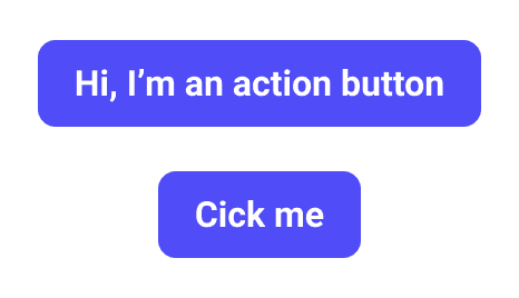
The infantry: buttons for your everyday actions
This is the one button we've all seen a million times and still love for its straightforwardness. It's the one that says "I'm going to do what's written on me". We use it in our apps when we require some input to trigger something, either a form submission, the cancellation of an action in an alert, validating a friend request or adding to a cart.
In a perfect world it could do everything, but there's just entirely too much for it to do on its own.
First, it needs a pal. Having one "action" button is fine but a bit naïve in a rich application environment: we will need to have a hierarchy of choices sometimes. For a primary action, we may need one (or several) secondaries. We may also need finer semantics, maybe some of our primary or secondary actions will carry a "negative" or "positive" charge.
This is our infantry, they are the buttons we put on the first line to do the busy work. They are not heroes, they are not here to catch more attention than needed but they can be fine tuned to fit most basic situations.
The specialists: buttons for repetitive, context-specific actions
The purist in me shuns icon buttons. Icons are subjective, you and I don't necessarily have the same interpretation of them. As a rule, icons with no labels should be avoided.
But let's look at it another way. When can spelled-out labels become a hindrance more than a necessity?
First, they become redundant when we've learnt how to use an interface. Using our smartphone keyboards, we do not miss a label on the emoji icon because we know touching it will open the emoji panel. We may not have known at first, but we deduced, we learnt. If every utility button, those we use constantly, came with a fully spelled-out label we would find them redundant very quickly.
Beside the redundancy, what makes the label annoying is when it detracts from the practicality of the icon button. Think of the text-alignment toolbar in a text editor.
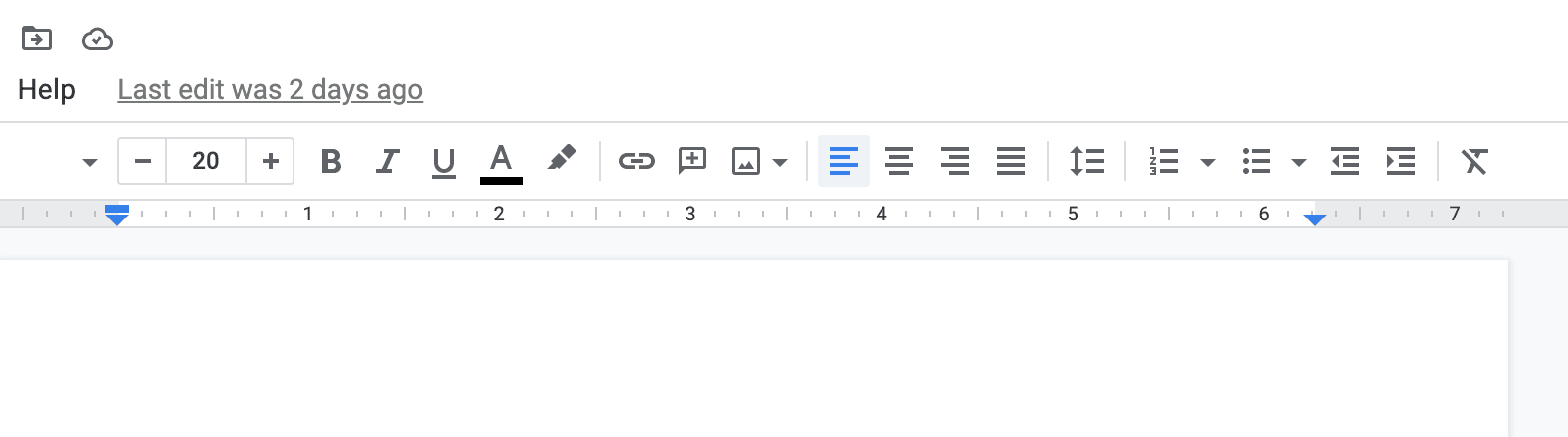
Now imagine the same one with a label next to (or under each) button. The whole point of having this toolbar is to have access to many quick actions in a single, utilitarian space. Labels would make it much less efficient.
Now I have acknowledged I can understand why the dreaded icon button can exist, I feel like I must atone.
They have a role, but they can't have all roles. They have hidden costs. They require learning and deduction, two elements that are like speed bumps in our abilities to quickly parse interfaces. They also require more accessibility work since they are not explicit. A screen reader that reads "Your are on button, magnifying-glass icon" does not provide actual insight to visitors. To help with interpretation we tend to use tooltips on icon buttons, preferably set on a timer so they don't jump at us at every mouseover. That's more scripting, more performance consumption.
Simply put, yes, they should be in our toolkit. But they should be used for very specific cases. I propose two of them. The first case is toolbars:
The second case is shortcuts, but more on that later.
The officers: buttons with higher purposes
Our toolkit now has two levels, if we put it on a scale of information hierarchy. Our action buttons, which are pretty much on the middle of that scale, and our toolbar buttons which are lower. What can we use if we need to go higher on that scale?
First, why would we need to? We would require a "stronger" type of button for two things: to draw attention (think of call-to-actions, these are no standard actions) or to structure our applications.
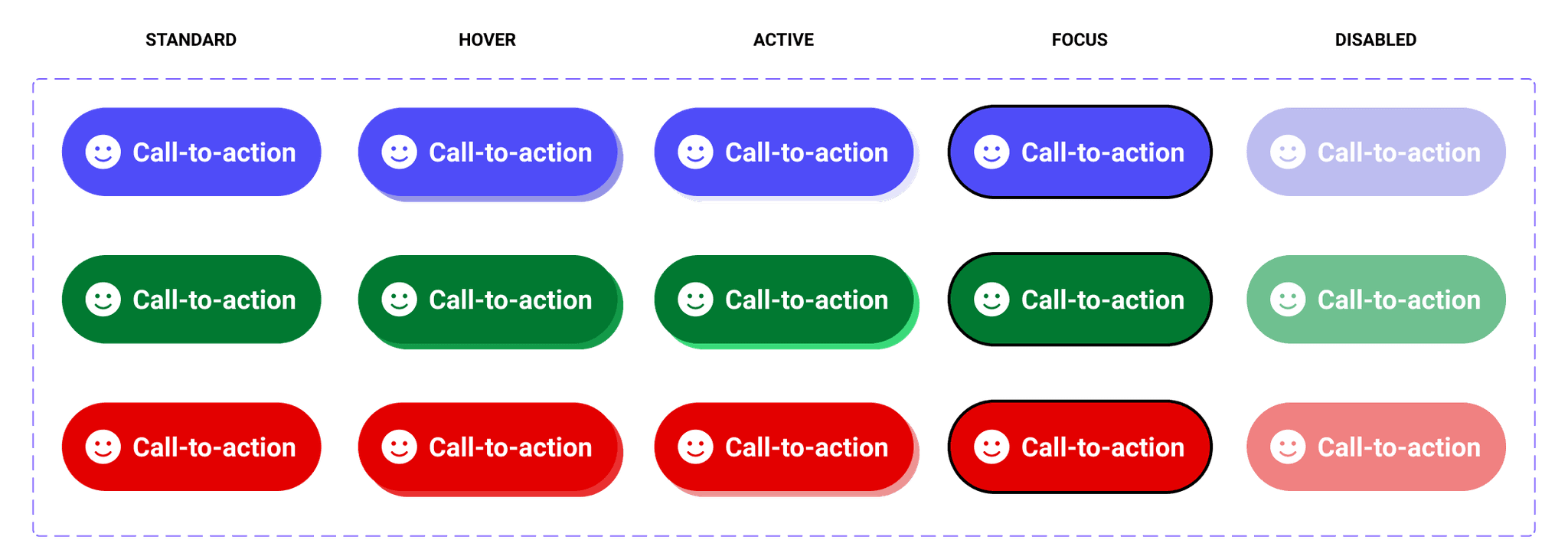
Let's start with the first kind. What differentiates a call-to-action and a regular action button? Rarity mostly. A regular action is something we may have to do a lot, it's banal. A call-to-action has a higher purpose, it's an invitation to click now, with no delay. The distinction is maybe easier to understand if you switch the patterns out. Imagine an interface where every button is demanding your immediate attention and a few of them aren't. It would be overwhelming.
The call-to-action role doesn't really invite a "secondary" type either. Those buttons are loner, they don't want anything stealing their show. We may still provide semantic variants of course: there is granularity to this pattern.
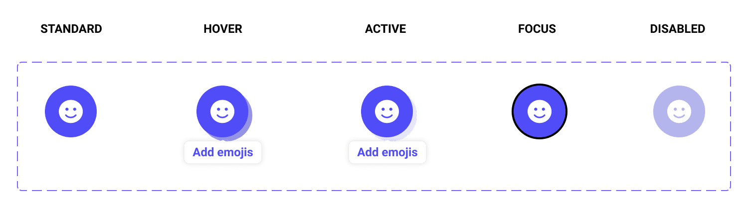
The second kind is the aforementioned shortcut button. That one is pretty famous, either through the hamburger menu button on mobile or the cog icon that says "yes these are the settings". They share the same issues toolbar buttons have, but they also share the same "raison d'être". They are stand-ins for repetitive, easily-memorized standalone actions. They need to catch the eye rapidly and thus sit higher in our information hierarchy scale.
Shortcuts help structure our applications. They lead to actions that have "above average" value but don't require immediate attention if not required. They're landmarks and not show-offs like our calls-to-action. They do not have to be icon buttons, that's largely dependent on your application's layout and the choices you've made for your other buttons, but it's an easy cop-out and has become familiar to many visitors. There's worth in familiarity.
It doesn't look like we'd need semantic variants for them though. As permanent landmarks, their role is fairly neutral after all. We may however need granularity, maybe a "secondary" variant could be useful. Right now let's assume it's not. After all, there's also a design in avoiding to create a pattern variant when it's not absolutely required.
Put side by side, you may see how our two hero buttons complement each other:

One must not let our attention escape its call, the other must be identified as a persistent landmark on our page. They are not like each other and yet have a similar heavy weight on a hierarchy scale. They are separate patterns of higher information value.
A common ruleset for our troops
We've outlined four patterns so far. A typical app may have many more of course, but this sample already helps us draw conclusions. Having a diversity of patterns does not absolve us from recognising that on our web platform, everything we've done here is simply styling buttons.
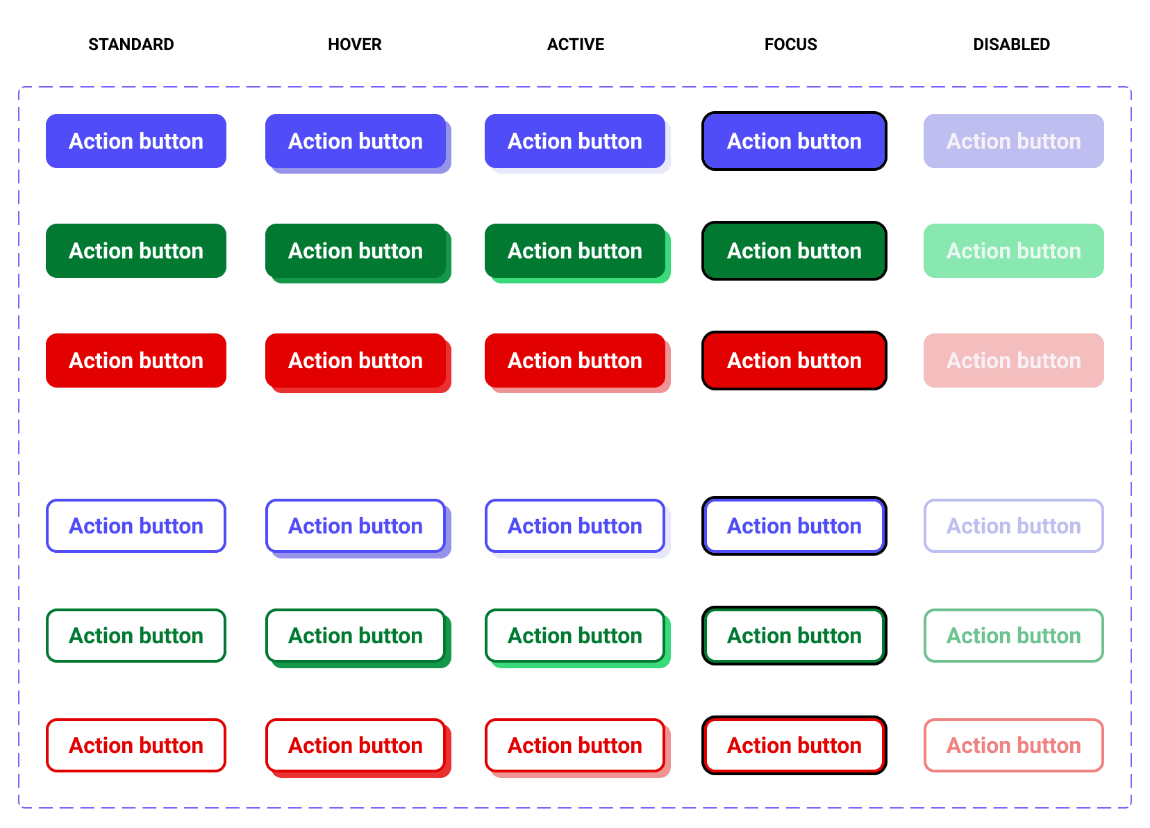
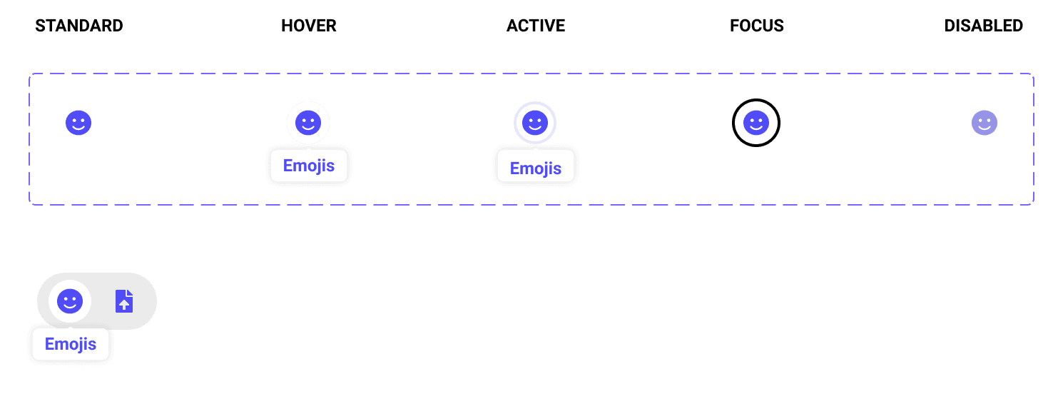
And all web buttons must answer the same basic design requirements:
- They must have a focus state (for keyboard navigation and contextualisation purposes).
- They can be disabled, and thus a design must be provided for that state if it's at all a possibility in the life of the pattern.
- They can be "active", or "being clicked" if you prefer.
- They can be mouseovered.
We've done all of the above, but if we were designing for an application or an in-house design system, we would also have to design guidelines for the button toolset.
We would need to provide rules, expliciting when a variant should be used instead of another. They would help others (other designers, developers and eventually visitors) make distinctions: a button is not just any other button. Its form infers its purpose. If we limit our design to a figma or sketch file, how can we guarantee that intent, that design language will persist across teams?
But for now there is no team. There's only me and the next part: coding this toolset!