2021-11-10
Theming: an abstraction for design tokens
10 min read - Benoit Rajalu
Theming is, eventually, coming to our apps in a shape or another. Dark themes are everywhere, championed as hallmarks of great user experience and accessibility, regardless of how regular 'light' themes were accessible to begin with... But it's not all dark.
User-configurable themes, white-labelling, high-contrast modes etc... There are many reasons why our apps are often better off being a little bit more than just what we initially planned them to be.
Designing for preferences however, that's no easy task. Maybe that's one more reason why we should do it to begin with: not because it's a challenge (this is no startup) but because it's sensible to do the hard things first.
But how? What does it actually mean, in a practical way, to design around the notion of themes?
Abstractions
Let's assume we're designing with Figma, but really the idea applies elsewhere (crucially as we'll see, it applies everywhere).
When we think about our theme (singular, let's start with one), we think about our palette. A theme is nothing more than a collection of colors, font styles, maybe spacings and shadows and other core concepts that may change from theme to theme. Simply put, a theme is a collection of design tokens, a concept that never ceases to be useful.
These tokens however are no longer immuable. What does that mean? Let's say that a color token named hot-pink has a value of #f542dd . That is clearly pink. The name of the token is related to its value.
But when we're changing our theme, when we're working on our dark theme for instance, or our user-configured one, will that still be pink? Does it make sense to use "hot-pink" when we actually mean "well, in the case of this theme, it's green"?
To avoid this, we require abstractions. An abstraction is a bridge between multiple values of the same kind, for the same purpose.
If our hot-pink token was actually a main-accent token, we would not have to think of it as "pink by default, but also maybe green, and sometimes it can be blue". It's simply the accent color. That abstraction bridges every use case neatly, and the values tied to them are no longer at odds with the naming.
Abstractions however lead to another need: semantics.
Semantics
The name of our abstraction is going to carry a lot of weight on its shoulder. We can no longer rely on basic 1:1 name-to-value signifiers: this is now a 1:n situation. One name, "n" values.
Semantics mean that we're not using blunt names anymore. We're looking into names with meanings. The reason is simple: beside the obvious advantage it has in bridging together seemingly irreconcilable values (pink, green, blue etc...), it helps us, consumers of those variables, understand how and when to use them. It pushes us to stop using our tokens as aimless colors to splash on a canvas. Instead, we can see them as purposeful ammunition, accomplishing a set goal.
This purposeful use of tokens is a necessary measure to guarantee theme consistency. Think about it: if we've been using "hot-pink" here and there because it "felt right", would it feel right when, in another theme, the value was changed? Maybe we used it in combinations that worked in our light theme but we may find that the same combinations with darker hues doesn't work!
Semantics help solve those issues. It helps create a layer of abstraction and purpose, yes, but it also helps bundle together "meanings" that will tie a design language together.
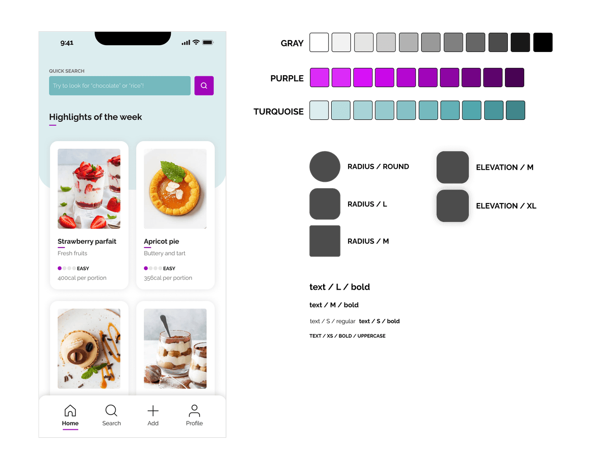
Here's an example. Here our tokens are built around non-semantic notions.
Next, semantic tokens are used to achieve the same result.
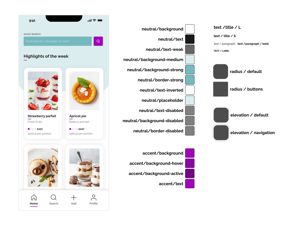
Because of our semantic namings, we were able to differentiate use-cases in a much clearer way. Our theme palette is more straightforward, easier to use, more predictable.
It also makes theming natural: a theme is just another expression of the same carefully curated palette of purposeful items: neutral/text can be whatever, it's no longer to the name of a color.
Analysis paralysis: the curse of choice
The example above is a simplification and yet, it already shows that semantic theming hinges on its consumers picking right, making the right choices.
The larger the theme, the more choice there is. More choice isn't always great. Having strong semantics may prevent people from making the "wrong" choice when using the collection, but it still relies on consumers knowing the whole list of options to know if their choice is correct.
What if we picked "accent-color" but there was actually a "warm-accent-color" in there somewhere we missed?
A plethora of options can have any of two bad side-effects: either consumers don't use any of the tokens because they can't be bothered with learning the whole collection, or they're stuck in endless loops of weighing their choices in fear of making the wrong one.
The blessing of opinionated dictionaries
There is however a way to circumvent the proliferation of tokens without necessarily cutting down on choice. A way that makes learning the catalogue of tokens easy and intuitive.
It is very well explained in this talk from Asana's Jina Anne, Ivy Wang and Ainsley Wagoner.
What they describe is an opinionated dictionary. A theme is not simply decomposed into semantic tokens: this semantic works like a dictionary where each entry is a definition of its use.
Consumers only need to learn the differences between the various tokens' "context" (which they call sentiment). We'd ask ourselves "what context is expressed by the thing I am currently designing? Is it neutral? Does it have another semantic value?".
This semantic "weight" acts as a key that unlocks the dedicated "sub-palette" for that context.
Is that neutral element featuring text? Then the correct color token for that text must be neutral/text! Is that text actually subdued because there's a need for hierarchy? Then it's neutral/text-weak. Is that button tied to a "negative" kind of action? Then its background color is certainly danger/background. As a button, it has different states that can rely on danger/background-hover or danger/background-active.
Each of those semantic context keys behaves the same way. You only need to learn the keys to understand the whole dictionary.
Implement into Figma
I'd love to tell you that Figma makes this all very easy. It doesn't. Design tokens aren't thoroughly implemented in Figma. We get "styles" libraries, but "1:n" abstractions? Aliases? That's not there yet.
It doesn't make the concept impractical though, we can still leverage styles libraries and do the job. We would start like we would for any style library: defining our range, the breadth our palette needs to address.
As we've seen in the Asana team's presentation, that scope revolves around the core concept of "sentiments" (neutral, success, warning, danger, upsell, selected and beta are theirs). They act like the semantic context keys described earlier. It's a very neat trick: as designers working on a component or a layout, we can instantly triage what we are trying to do through the filter of these "sentiments".
 Picking the right token is no longer about its value, it is about its meaning
This excellent slide details the process further. A sentiment is then paired with an "usage" (because we're discussing colors here, there aren't that many usages to consider: texts, icons, backgrounds and borders will cover it all) and it can be further specified with prominence and interaction modifiers.
With this blueprint in mind, we can build our Figma style library fairly mindfully, defining our ruleset and guidelines along the way. For instance, can our success/background work on top of our neutral/background-strong? Maybe the contrast doesn't match our accessibility requirements? What about our neutral/text-weak on top of danger/background? Does it match? Is it allowed?
The Asana convention of naming is flexible enough to match other companies' use cases for sure. What eventually matters is that your UI team (designers and developers both) are able to clearly identify what's what. It's also extensible to other tokens such as text styles, spacings, border radiuses, box-shadows etc...
Here's an example Figma file. Editors have this view in the right column with the complete style library. When we need to build another theme, we can simply duplicate that file and create a new library based on the exact same naming and exact same ruleset as the base one. As Ivy Wang says in the talk, that way designers crucially "don't have to worry about dark mode" or any theme: they can work with the base one and know all the other ones will work just as well.
If they feel like checking, a Figma plugin such as Themer makes it very easy.
From design language to shared language
Here's the thing: themes on Figma (or design tools) are neat but they're only the first step. Let's move on to implementation in code.
It's actually very straightforward: it's the exact same concept of abstraction but applied to the development toolset.
On the web, CSS does abstraction fairly well. What we need is a stylesheet hydrating some CSS custom properties. Something like that:
html {
  --neutral-text: hsla(0, 0, 0, 1);
  --neutral-background: hsla(0, 0, 100, 1);
  --accent-background: hsla(292, 100, 40, 1);
  --negative-text: hsla(0, 100, 28, 1);
  ...;
}
Sure, these are "1:1" key-values pairs, but you can override CSS custom properties as you see fit on demand.
html[data-theme="dark"] {
  --neutral-text: hsla(0, 0, 100, 1);
  --neutral-background: hsla(0, 0, 0, 1);
  --accent-background: hsla(292, 94, 49, 1);
  --danger-text: hsla(0, 95, 47, 1);
  ...;
}
In this example I chose to hydrate the CSS custom properties inside a scoped block. I'd need to inject this stylesheet and toggle a data-theme attribute on the HTML DOM node for it to work. You may also choose to only load the necessary stylesheet for the requested theme: the overriding concept remains the same.
Regardless of your injection choice, this works for all themes. We only need to call the proper CSS custom properties in our styles to ensure everything works with every theme we throw at our application:
.header {
  background: var(---neutral-background);
}

.header li a {
  background: var(---accent-background);
}
This ruleset applies regardless of the theme: it's agnostic. The variables clearly illustrate the intent. The values themselves don't matter anymore.
Smart distribution of theme tokens
CSS custom properties are nice but they are not the best way to distribute tokens. Depending on your styling technology of choice, you likely have access to better variable systems.
In SASS, you can distribute your tokens like this:
$neutral-text: #{var(--neutral-text, hsla(0, 0, 100, 1))};
$neutral-background: #{var(--neutral-background, hsla(0, 0, 0, 1))};
$accent-background: #{var(--neutral-text, hsla(292, 94, 49, 1))};
$danger-text: #{var(--neutral-text, hsla(0, 95, 47, 1))};
Which you can just as easily do in your CSS-in-JS solution of choice:
const theme = {
  neutral-text: 'var(--neutral-text, hsla(0, 0, 100, 1))',
  neutral-background: 'var(--neutral-background, hsla(0, 0, 0, 1))',
  accent-background: 'var(--neutral-text, hsla(292, 94, 49, 1))',
  danger-text: 'var(--neutral-text, hsla(0, 95, 47, 1))',
}
But that part of the job is tedious. Who wants to copy and paste every single "style" value from Figma into at least one CSS stylesheet and one distribution file (JS / TS / SCSS / ...)? Plus what happens when a value changes on Figma? When a new theme is created?
That's where tools such as Supernova, Specify (now defunct) or Diez can save you a lot of time. Their purpose is to sync your Figma source to your distribution model of choice. They take the tedium out of the whole concept.
If you need more fine-tuning, this great series of articles from my very talented former colleague Nicolas will help you set up your own system.
Theme once, automate distribution, profit?
We've built a system in Figma where designers don't have to worry about themes anymore. We've ensured designers and developers speak the same language, giving them the same variables (with the same names) to work with. We've even automated the distribution and the integration of those variables into our codebases.
Are we done? Mostly, yes. What's left is the human element. None of that works if nobody consumes the tokens. If designers aren't using the tokens everywhere, then those designs fall outside of our systemic themes. If developers don't use the tokens (and equally importantly don't update their legacy work with them) for everything, the issue is the exact them.
It's one of the benefits of developers and designers sharing the same language: we also share the same responsibilities. What we do with them defines how successful we can be.