2021-07-10
UX Files - The UX of waiting
8 min read - Benoit Rajalu
This article is part of UX-Files, a series in which we give a stern but loving look at web interface patterns. This time let's talk about waiting.
When we build our applications we focus on the core experience, on the features needed, on the value. We may invest some of our time budget on the fringes of that core experience: errors and empty screens for instance. There's however a core experience our products share we don't always plan for: we will make visitors wait.
We know they won't like it. We know we should be trying to limit that as much as possible (but do we?) and yet, sometimes we can't avoid it. Fetching data takes time. Computing takes time. The length of that time is hard to predict, it depends on our backend and on the client's available resources and their connection.
There are also instances where we want people to wait, when a delay is a choice.
So what do we do? How do we make this fairly unavoidable thing feel like more than a shameful afterthought?
The price of waiting
We obviously know that nobody uses our applications to wait. Each time we ask them to, we waste some of our visitors' time and spend our patience budget. Why then would we risk that expense?
We sometimes need to perform tasks that are not synchronous: they do not happen immediately, they wait for "something" (a server response, the result of a long calculation...) and then they can be completed. That's a delay, a potential dent into that patience budget.
We may also need to load data in our UI, again waiting for a server response before we can fill the space. That's another dent.
Our initial load is very much the same. Our application or website takes time to load when first launched, and on every subsequent page load. This costs a lot. Even if people use our app for fun, nobody wants that fun to be delayed. If they use it for work, or because they have to, then that delay is even more of a waste. And if they found our website or app by chance... waiting for it to load may be enough of a reason for them to bounce.
An ideal website load time should be no more than 2 seconds. The probability of bounce rate increases by 32% if the page load time increases from 1 to 3 seconds.
Source: Pingdom
The ultimate cost we pay for making people wait is their disengagement.
Make choices and stick to them
Knowing that too much waiting can cost us our visitors, we must act and make their experience as smooth as we can.
We saw above that our patience budget was spent on three "families" of waiting: initial load, subsequent loads and scoped loads. With that in mind we can begin to create a strategy, a thought-out way to deal with each case that will focus on the experience first. The alternative is to scramble each time a delay occurs somewhere and waste a precious part of our visitor's patience.
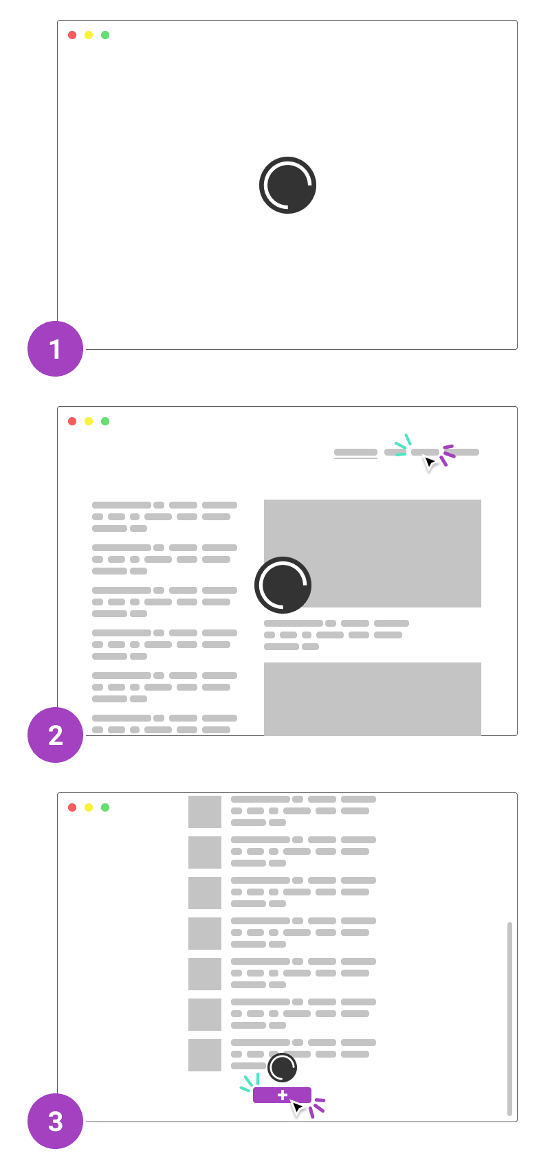
Initial load
That one is obviously tricky because there is very little we can do to cheat our way away from taxing our visitor's patience. They're not even on the page yet, we can't distract them with pretty animations and graphics. That initial load is emblematic of "UX is not just UI".
There are still many things we can do to limit that initial loading time: minifying our resources, limiting the amount of external calls needed for them, managing our server's response time, rendering the page server-side... We may even defer the loading of some resources until after the essentials part of our page has been received by the client.
All of those are pretty technical strategies (a more detailed article can be found here) but they are also fundamental. We often forget that our visitor's experience starts with our infrastructure. Luckily once we've invested time there, the result is most likely going to be pretty long-lasting and low-maintenance.
Subsequent loads
Once we've loaded our application we will still need to load more content as it becomes needed. On some websites, we'll need to load entire pages again like we did on our first load. Our strategies would then still apply.
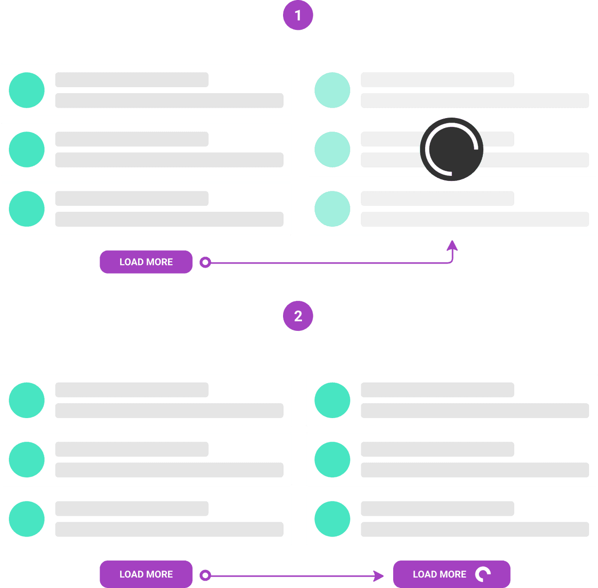
We will often try to avoid these complete page wipes and only load the parts we need. This creates situations where a part of our app is there on the screen, but the important data is in a loading state. Our visitor has loaded our app and yet they still need to wait, how dire!
Our infrastructure will ideally lessen the blow and we won't stay in that fugue state for very long. We still need to handle that. Think about it this way: you've just clicked on a button to "load more products", what then? Do we immediately signal that the app is loading something, even though maybe that loading time will be minuscule?
Showing updates as fast as possible seems like an obvious goal. But is it, always? I don't think it is when you fetch (IO). User perception research shows that a fast succession of loading states (flashing and hiding spinners) makes the transition feel slower.
Source: Dan Abramov on Twitter
In some instances, it's better to actually do "nothing". That's as valuable a trick in our experience repertoire as any other.
But what do we do when that's not an option, when there is a very large amount of data to fetch or a large rendering task processing (or indeed when a short one takes an unexpectedly long time)?
It's then common courtesy to warn the customer that there will be some waiting. It's better though to use that space, that time to give them some pointers. In video games, loading screens have become somehow part of the experience. They're used to display tutorials, tips, artwork etc..., things that are at least trying to be enjoyable. We'd still prefer not having them, but studios have worked in order for us not to mind them as much.
Think about the Chrome dinosaur game. Its point is to make something that sucks NOT suck as much.
That is something we should think about. We have a different context to take advantage of, we don't have to block the screen in any way. In our case it's important to keep the "flow" of the app going: maybe our customer can do, or read, or browse "something" else on the page while we wait for things to load. We need to keep that in mind and build around that.
Scoped loads
Our subsequent load issue has a close sibling: scoped tasks. There are plenty of examples: deleting an item in a list, adding to that list, clicking on a "like button", adding a comment to a post etc... We rely heavily on the principle that our customers will perform an action which will eventually reach our servers, update a database, trigger a response and thus yield a result.
To better highlight how tedious those smaller loading events can be, imagine we are at the restaurant. Let's consider the initial load as the queue before entering the place. The subsequent loads are the wait between each of our orders. The scoped tasks then could become imposed timers between each bite, where we would have to wait for a signal allowing us to pick up the fork and keep eating.
It does not look like the kind of experience we would want to provide. To avoid that, it helps to sort our scoped actions in two groups: some are blocking the flow of the app, some are not.
Blocking the flow
Blocking scoped actions are the ones we need the result of before anything else could be done. A very common one is what happens when you move files around on your computer: that will trigger a loader and those files are no longer available to be edited. That's a simple technical necessity: in order to perform the task, other tasks must be avoided. In our apps, we may find some similar constraints but the business often dictates some more.
A classic blocker example is one that requires credentials. If we need to confirm our credentials before performing a "dangerous" action (let's say deleting a list of users), we will need the server to respond with the A-OK before we proceed.
Honestly, there aren't many good reasons to block the flow of our apps that way. Our blockers should be rare. They will always make our app feel tedious. We must use them sparingly and communicate clearly why we're doing it. Ideally, we would also communicate how long they may take.
Let's go back to our restaurant example: if we know we're going to wait for our meal, isn't it better to know how long it will approximately take? Sure, we'll get annoyed if it takes a bit longer, but we'll also be glad if it's shorter and in any case we're better informed as to what we should expect. And we're grateful for that. Our customers would be as well.
Not blocking the flow
From our customer's point of view, there are few other good reasons to block the flow of our app waiting for a server response. Deleting an item in a list? That should be instantaneous! Liking a post? Why would that require a loader!
As devs, we're often tempted to forget that...or to pretend we forgot. It's easier to do the usual and build our UI on top of our technical limitations. That's a rather candid outlook: it's based on the idea that the server may fail and we don't want to lie to our visitor, so we'd rather display a loader and cross our fingers.
Enters optimistic UIs. As the name implies, we change our mindset and update our UI before the server pings back. It's a trick! We can make our customer think their action has had an instantaneously positive result. If the server fails, we can catch that failure and rollback, inviting the visitor to retry. Of course we're now betting on the idea that failure will be extremely rare...which it statistically is for most of those small tasks. This article dives into a detailed "like button" example.
That should be our default whenever we encounter scoped loads, yet it doesn't come for free. We wouldn't want to spoil our enhanced experience with sub-par error management for instance. We still need to be able to tell our visitor what went wrong and where.
Indeed, optimistic UIs also mean that our customers are free to move on. Think of Gmail's behavior when you send a mail: you're not stuck there watching your email being sent, you're back on the listing, browsing etc... If that message fails to be sent, Gmail will tell you and offer you the possibility to try again.
That is the kind of strategy we need as well.
Beyond waiting
The obvious point of taking the waiting experience seriously is to make it disappear. By reducing our initial load as much as we can, we will profit off that work for the subsequent loads. Sure, we can't make every subsequent load time instantaneous. We still need to tailor that waiting experience.
But the crux of moving from a "wait-based" experience to an optimistic one gives the illusion that there's no waiting time at all. We try to move past waiting and to raise new questions: how to handle errors when page context might change, how to handle retries etc...
There's no denying the best waiting experience is the lack of it. And sometimes, we can actually provide that, even if it involves taking things outside of the contraints of our applications' clients. For instance, maybe customers waiting for long, complicated outputs of their databases into neat .csv files would rather simply recieve them as an email than watch a loading screen?
We may not find shortcuts, detours that make patience irrelavant, and until we do it's up to us to make sure we offer a better experience than elevator music.