2020-12-23
UX Files - The UX of notification toasts
6 min read - Benoit Rajalu
This post is part of UX Files, a series of articles where I investigate interface patterns through three lenses: UX, UI and development. Let's start with a look at the Toast.
First things first: we all know UX is a larger endeavour than simply dissecting UI elements after the fact. It should inform which patterns to use rather than come with ways to justify them. I don't know your app, the mood you are trying to set, the story you want to tell or the userbase you want to target. These parts you'll have to fill in yourself.
With that in mind, let's ask the right questions. Why should Toasts be used in a user interface? Let's have a look at what they are to begin with.
What's a Toast?
In its most naked form, a Toast is a piece of information that pops somewhere on the screen. It is a small pop-up meant to be less obtrusive (but still nowhere near discreet) than a full-on dialog.
It is a well documented pattern. Here's what various high-profile docs have to say about it.
When the [toast] is shown to the user, it appears as a floating view over the application. The user will probably be in the middle of typing something else. The idea is to be as unobtrusive as possible, while still showing the user the information you want them to see. Two examples are the volume control, and the brief message saying that your settings have been saved.
Source: Android docs
Flags are used for confirmations, alerts, and acknowledgments that require minimal user interaction. These event-driven messages appear by overlaying content at the bottom left of the screen, emerging from the navigation sidebar.
Source: Atlassian Design: messages - Atlassian Design: flags
Toasts display brief, temporary notifications. They are noticeable but do not disrupt the user experience and do not require an action to be taken. Toasts should only be used for confirmations, simple notifications, and low-priority alerts that do not need to completely interrupt the user experience.
Source: Adobe Spectrum
Snackbars provide brief messages about app processes at the bottom of the screen.
Source: Material Design
Toast should be used for short messages to confirm an action, not go over 3 words and rarely be used for error messages. Use it for success messages or non-critical errors that are relevant in the moment and can be explained in 3 words. For example, if there's an internet connection issue, the toast would say, Internet disconnected. Avoid using toast for error messages. Always try to use a banner to prominently inform merchants about persistent errors.
Source: Shopify Polaris
That's only a handful. It seems most design systems out there have their version of the Toast, with more or less opinionated guidelines to go along with them.
Families of Toast
The Android volume control slider popping in and out of sight really is an example of a clever use of Toast: it does not navigate away from the current page, it does not need to be persistent and thus it comes and goes. This interaction does not translate to many use cases on the web, but the second example does. It's a common pattern, found in the Gmail app quite a bit: when sending an email the app moves back from the mail detail view to the mail listing but it displays a Toast informing the message has indeed been sent (with a time-limited call to cancel the action). Notably, Android toasts are all built to fade after a set duration.
In Atlassian's Jira, there are many ways to trigger a toast (which they call a flag), one of them is through keyboard shortcut actions. When you're assigning a task to yourself through the keyboard shortcut "I", a toast pops-in assuring you the action has succeeded. It then fades away. Your name and / or avatar are clearly displayed on the task to assure you the assignment has been made. The toast acts more like a gentle reassurance than an unmissable feedback.
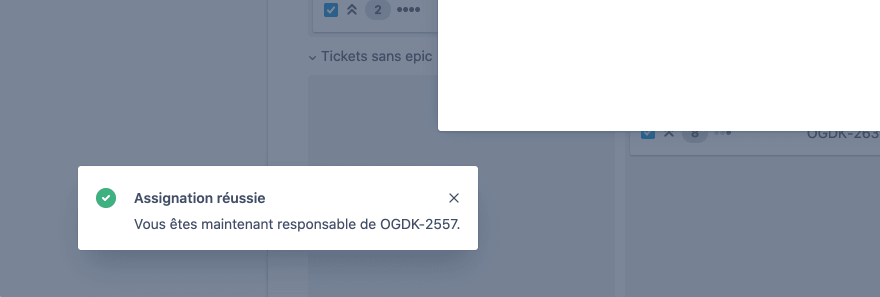
This toast will fade after a few seconds but the result of this action is visible elsewhere in the app.
Discord also has fading toasts, they have a reverse loading bar and will disappear when it reaches zero. If the Toast is hovered, the countdown pauses. It will fade away in the end regardless.
Not all Toasts fade though.
In Trello, Toasts live on the top right corner. They can display important notifications relative to your current connection. They are unrelated to the current action or a side effect. They will remain displayed until dismissed or no longer relevant.
Google has the same approach for its cookie notification or to push surveys to their visitors. The Toasts will remain on screen until they are dismissed.
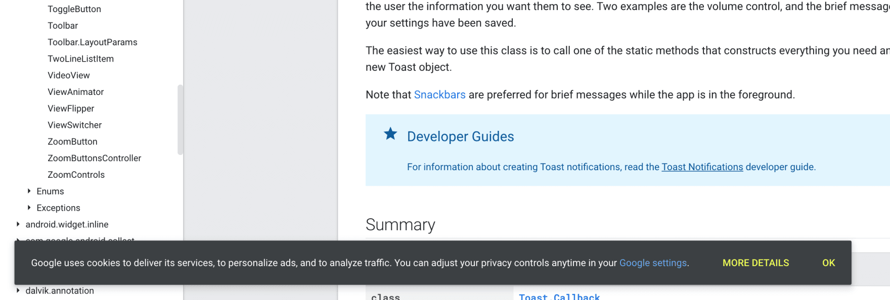
This toast will only be disappear if manually dismissed
Microsoft Windows also interestingly has a built-in toast system which is considered a step of importance below its Notification Center. The Windows Toasts are not designed to fade, they are persistent calls-to-action at a system level.
How to pick a Toast
There clearly are two different use cases for toasts:
- Display short lived feedback, the kind that fades. If anybody misses them, there are fallbacks.
- Display long lived, non-page specific but actionable information.
It boils down to a simple question: if the Toast results from an action, is there another element somewhere in your UI carrying the result of the action? Then it's ok for the toast to fade.
In this and any other cases, if it's ok for the toast to fade, it must be ok for the toast to have been missed (the attention was not catched, the page was no longer being watched etc…).
If it cannot fade, then it can't be strongly related to the current page. Simply put, persistent toasts should carry their own context: they may be persistent but the page or context around them may change.
Why use a toast?
From what we learnt of their behavior, I'll settle on these dos and don'ts. That's as much opinion as it is a compilation of the guidelines found in docs.
- Don't use fading toasts for trivial feedback. Toasts have a high impact on the eye and should not trigger at every other moment: they are a distraction.
- Do use an automatically fading toast to reinforce the feedback given more permanently in your UI. A keyboard shortcut has been used to perform an action? Display a fading toast and update the UI tied to that action. A background task has completed? Display a toast bearing the good news and update the relevant UI accordingly.
- Don't use an automatically fading toast if it carries information that absolutely can't be missed. The current account's billing information is out of date? Clearly this should not fade until dealt with. A background task is ongoing but is not reported at all on the current screen? A helpful toast can display real-time progress information and offer a way back to the right page.
- Don't make your app look like a never ending stream of notifications. If you find yourself relying too much on toasts to give feedback, you may be needing an actual Notification Center.
- Do use persistent toasts to display application-wide information that can be acted upon. The connection has been lost? Offer to reload the page. The billing information is out of date? Offer to redirect to the billing page.
- Do plan for priority collisions. You never know when two Toast-powered events may clash.
- If you cannot guarantee your toasts will never be on top of any other kind of content (and you probably can't), make sure they can be manually dismissed. There are few things more frustrating than a UI element stuck on top of what you are actually trying to see.