2020-12-23
UX Files - The UI of notification toasts
12 min read - Benoit Rajalu
This post is part of UX Files, a series of articles where I investigate interface patterns through three lenses: UX, UI and development. Let's start with a look at the Toast.
Part one of the series was about why we could need a Toast in our lives (and when we really should not). Part two is about the way a Toast should look, but it's more than just that. It's about design, which on the web is at least three things: how it looks, how it behaves in all situations and, crucially, how it should never look or behave. It's basically a series of "what ifs" translated into mock-ups and guidelines.
Admittedly it can't be about designing the one true Toast for all. I don't know your app nor the mood you are trying to set. Maybe you want to make your toasts cheeky or playful, animating them in a way that would be out of place in a less entertaining environment. Maybe you don't ever need for them to disappear automatically. Maybe you need them to come with sound design because you really want to annoy the hell out of your userbase.
What I'll eventually code will be based on a subjective but vague enough blueprint. I want to design an opinionated Toast that matches the UX criteria we collected in part 1, knowing that this design will be done in a vacuum. No app guidelines to follow, no design tokens, no nothing. Basically an agnostic Toast that fits most but not all scenarios.
Let's go through my choices and the questions they try to answer.
What do we need?
Making choices is great but first we need to know where we're going. Let's make a shopping list that will let us build the agnostic Toast.
First we need a shape, a wrapper for the Toast's content.
We need content next, which features:
- Some text. That is mandatory regardless of the type of Toast, we must be "saying something".
- An action. It could be a button, it could be a link, it could be omitted if not needed.
- A way to dismiss the Toast when we are not using a self-dismissing type.
We also need a "stack", something that lets us display a Toast somewhere in our app, but that can also handle what happens when more than one Toast has been created.
We need to know how the Toast behaves. What happens when the content is long? When it's short? When the optional elements are removed? When it's at the bottom of the screen? Designing for the web means trying to answer questions the developer will need to ask themselves to make the thing work in a browser: it's always best to see it as a collaborative job rather than a lone designer's responsibility.
That looks like the minimal shopping list to build a minimal Toast... We can make it a bit more interesting.
Maybe we need a reverse loader to show how long a self-dismissing Toast will stay displayed?
Maybe we need a set of animations, a motion language to make sure our Toasts catch the attention?
We could also need ways to differentiate semantic types of Toast. Some carry a heavier notion of urgency or importance than others (ex: errors, asynchronous successes etc).
Let's get shopping then.
Building a toast
Shape and content
The hard work answering the "how does it look" question is done here. The industry isn't particularly original with the shape of a Toast and neither was I.
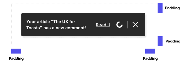
Sticking to a standard is a choice. Not having to teach the ins and outs of a pattern because it's so familiar already is tremendously time-saving. Something ubiquitous can of course be bad, but here its qualities are easy to justify: the rectangle's horizontal flow helps structure the content of the Toast. It enables us to clearly separate information, action, flavor etc… It's a comfortable vehicle for flowing information relying on natural reading orders.
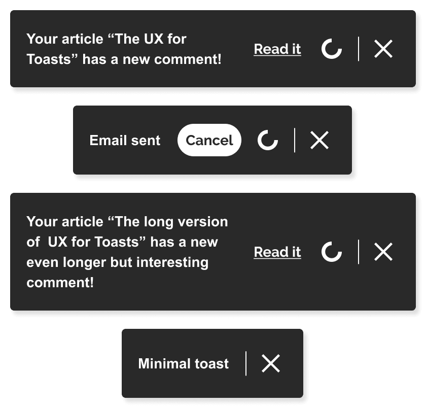
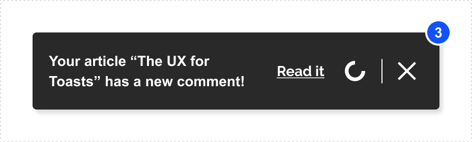
The content capitalises on that. The design indicates that only the copy and close button are mandatory. An action and a reverse circular loader (a countdown) are optional add-ons with specific places in the reading order.
Here the design delivery needs to encompass guidelines in order to describe what can't be shown in the mock-up:
- The loader must be present for all self-dismissing toasts
- The action should be a link when clicking on it will change the current page, a button when it won't. I am old-fashioned that way. They are obviously different patterns that are thankfully well-represented in code so let's take advantage of that in our design.
- The label for the action should be very short, it saves up space and lets the content be the main driver of meaning.
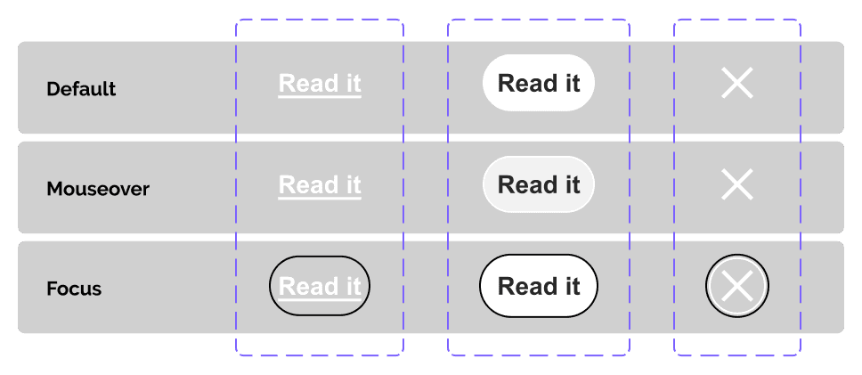
Having interactive elements also means the developer will have to plan for their various states; there too the design must provide.
All of this tells us how a Toast should look but it raises new questions. What happens when there's too much content? We provided some examples of reflow but nothing extreme. So far the developer can't tell if the Toast can extend indefinitely.
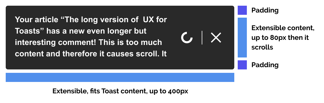
So we tell them that it can't. In our guidelines, we would ask that the content of the Toast should be kept brief and minimal. They are not full dialogs, they are gentle interruptions. Limiting the shape's height also helps ensure that under a large zoom for accessibility reasons, the content can reflow into a scrollable shape and not be lost outside the screen's space.
You may have expected icons. After all they are present in many Toasts designs. Remember though that I am not building this for any particular app. Icons are highly personal. They're the socks of your UI. Everybody has them and you don't really want to have to use anybody's but yours. So this design dispenses with socks altogether.
Now we've got a pretty good handle on our Toast, we need to give it a place to live.
The stack
The stack's job is mostly to answer the questions regarding the Toast's behaviour in space. It's not as much a design you can see as it is information to add to our guidelines.
For us, the stack will stick either to a corner of the screen on our app or be centered at the top or bottom of the screen. It's going to display one Toast at a time. As we've discussed in part 1, a Toast is not trivial and we should not abuse them. Limiting our stack to one Toast tacitly ensures we will never display a stream of Toasts that litter our application.
We could trust our dev to limit the number of Toasts programmatically but that would raise new questions: what do we do when one more Toast is pushed when the stack is already full? Should we remove the oldest? Should we remove one that is "less important"? How do we define importance? This design simplifies the management of the stack's state.
If more than one Toast enters the stack we only need to indicate it with a counter.
The counter should be positioned according to the stack's placement on the screen. It's on the top left corner if the stack is in the top left, same goes for all corners. If the stack is centered at the top or bottom, so the counter must be. This ensures the counter does not relate to the size of the toast: it will be at a persistent place within the stack regardless of the stack's contents.
I originally planned to design the stack with a preview system, showing a fraction of the next Toast in line. That choice had a waterfall effect on the shape and content though. I had planned for their width and height to be flexible, how would that work with the preview? How would the stack handle that system if it was sticking to a different part of the screen? Sometimes a choice seems like a good one until its costs seem to pile up.
We will eventually have to pay for all our choices, not least the necessary price to meet the requirements of accessibility (of which there could be many). How will we fare against screen reader technologies? How will our Toast scale under a large zoom? "No plan survives contact with the enemy" should be on our minds every step of the way. We should be ready to correct the course when we bring our design to the real world. Keeping it simple from the start really helps doing just that, so I retired the preview idea and kept things simple.
As we've seen, the stack comes with a few more invisible parts, and thus our guidelines grow:
- Do not self-dismiss a Toast that hasn't been fully displayed yet. This means the countdown for a Toast should not start until it's visible in the stack.
- Do stop the countdown on a self-dismissing Toast when the focus or the mouse is on it. This prevents the Toast from fading while someone's getting ready to interact or read it.
- Do reset the countdown on a self-dismissing Toast if it gets pushed down in the stack order. If it was visible but something more important came up and hid it, then stop the clock and restart from the top when it's time to show the Toast again.
Extra mile: variants
Our shopping list mentioned two more items: semantic variants and animations. Let's start with the variants.
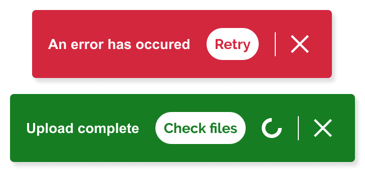
I've settled on two variants, one for negative feedback and the other for positive ones. Using the whole shape to carry the weight of the semantic really fits the mentality of what the Toast is: a glanceable, low interruption but high impact notification.
Since this design allows more choices to be made, it comes with an extended ruleset. Remember, designing for the web is answering as many questions as possible before they need to be asked: long guidelines are more helpful than they are a hindrance.
- Do ensure a "negative" or "positive" Toast has higher priority than a default one.
- Do ensure a "negative" toast has a higher priority than a "positive" one.
- Do ensure a "negative" Toast doesn't fade automatically. This means a negative Toasts cannot feature the circular countdown.
- Don't use a "positive" Toast for something that happened without delay. If the Toast is the immediate consequence of an action, it is just an information. Keep semantically "weighted" Toasts as resolvers of suspense.
Some of these rules will translate to "impossibles states" for the developer: cases that their implementation must never be able to create. Others are more akin to ground rules for the future wielder of the Toast. All of them are the intangible part of design. They are the choices that dictate how it works, not how it looks.
Extra mile: animations
So far we have provided static elements of design that are firmly in the camp of "confidently reproducible in a browser". As a (junior) designer, I can safely assume the dev team will be able to code a rectangle with some copy in it. It is however less practical to assume the developer will be able to match simulated animations.
Figma lets me design the micro interactions for sure. In some cases, it might be a good indication of what the design team expects. However designers do not have to design for the developers. They can design with them. Unless you are using a direct app-to-code generator, building an approximation of what the dev will be able to do in the browser might frustrate both the dev and the designer. How many grand and complex animation dreams have come out unscathed from the test of ruthless HTML specs, funky CSS constraints or dire browser performance worries? Probably not many.
When you have the luxury of communication and your needs are not very specific, animations can safely be relegated to guidelines at first.
- Animation should feel natural inside the stack, taking into account its position. A stack positioned at the bottom of the screen should introduce its Toast with an upward movement. Opposite emplacements mean opposite animations.
- The circular loader should be linear.
- Every state change on a button or a link should be smooth.
Designing with the developer means that they can develop these animations directly with the designer straight into the browser with the guidelines as a reference. It's overall a less frustrating experience and it helps everyone understand "the other side" a bit more.
Design systems such as Adobe's Spectrum provide in their guidelines much more than animations, like this detailed rundown of the priority queue for Toasts. These are very helpful: guidelines are lights on the path of the dev team, they are a specification of intention and they create a basis for discussion between designers and developers. They plan for the road ahead.
Closing thoughts
We set out to design Toasts that can be either persistent or not. They should carry non-trivial information understandable and actionable at a glance. I believe this design achieves that. Another way to say it would be: it can be legitimately argued that the choices made meet the expectations.
It provides the important stuff for the developer beyond the Toast's basic looks. We deliver the states of the interactive elements (mouseover and focus states are non-negotiable), how to handle reflow (the copy content can be more than one line) and the guarantee that the colorset is accessible. It clearly documents what happens when an optional element is not there.
What the design cannot show, we have provided guidelines and rulesets to tell. We tried to give an answer to as many questions as we could short of actually building the damn thing.
We've therefore completed the first step of designing the Toast: we've made the plan. The next part is the journey, and it will happen in the browser.